Product Usability and Product-Market Fit are two considerations every start-up must address when building their business. The success of your entreprise will hinge upon how well you execute in these two areas.
But it is important to highlight the differences between these two features. A common trap is that entrepreneurs will think that if their product is usable, it must have a strong fit to its market. This is not necessarily true.
While usability might be a part of your product’s value proposition, other elements determine your market fit. Those other product characteristics need to be considered and evaluated as well. Some entrepreneurs will focus exclusively on usability and will develop a product that never fits with their market, leading to a failed business.
Product-Market Fit
Product-market fit defines the niche in which your business operates. Just as a fish wouldn’t last long in the desert, your product won’t last long if you don’t deploy it under the right circumstances.
For a more business specific definition, product-market fit is about how useful your product is to your target market and whether they are willing to pay for it.
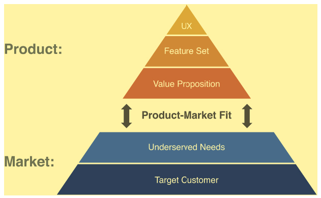
Consider the following pyramid image that relates to your business and what you have to offer to the larger market (more details about the product-market fit pyramid).

source: the lean product playbook
Your market is the basis for your business. Without customers that need something you can not exist; the premise of what you do is based on the needs of someone else. The capstone of your business is comprised of the value proposition that you offer those individuals in need, the features you will provide to satisfy those needs, and the experiences that those individuals have interacting with your platform will define whether people will try your product.
However the product-market fit provides the bridge between the basis for your business and the argument for why customers should try and continue to use your goods or service you cannot guide potential customers from focusing on their needs to the potential value that they can obtain through your products or services.
Something with a good product-market fit satisfies a need that a customer might not even know they have. The product saves them time or makes their production process better or improves the quality of their own product or service. A product with a good market fit is something that, once a customer tries it, becomes so indispensable that they can’t imagine trying to do their job or lives their lives without it. As a result, they are willing to pay dearly for it. That is how you build your business.
Developing product-market fit is a nuanced, involved process that can take many iterative cycles to achieve. We will discuss this process more in-depth in later blog posts, but in the interim consider the following. It is easier to diagnose usability problems than product-market fit issues. People can easily express why they do not find something easy to use, but it is harder for them to express why they do not find something useful. It is the issue of “usefulness” that defines product-market fit and when you find it, that connection between good/service and need will evoke a sense of relief in your customers that will make them dedicated to your business. If the product-market fit is strong enough, it can overcome small usability issues.
Usability
Usability is about how well your product thrives in its niche. Being in the right environment is not enough; your product has to be optimised so that it takes advantage of all that space has to offer.

Usability measures how well someone can make your product do what it is supposed to do. A website with high usability is easy to navigate. You can find all the information you are looking for easily, and with very few clicks. The most important, most often used information and functions are located in places where the average user looks the most. For the user, it is almost like the site is clairvoyant; as soon as you have a thought of something you might need to do, it appears in your eye line.
On its face, the idea of usability appears to be straightforward, especially in a world defined by Apple products. Usability speaks to the idea that anyone should be able to pick up a product and with minimum effort learn how to use it to do the things that the product was designed to do. That is how it appears and should feel to the end user.
For the developer, however, the challenge of usability is much more complex. For a developer, a product she designs is imminently usable because she built it; she knows where everything is and how everything works. It operates within her worldview and the paradigms and thought structures in her head.
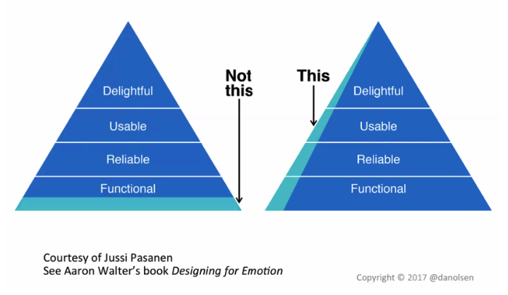
However each potential customer has vastly different paradigms, so how they view and understand technology will vary person to person. This poses a huge challenge to the developer, as it is her responsibility to find the commonalities of perspective among her target customers. What complicates this further is that customers are no longer content with a product that merely works; Apple changed that perspective so that now people need to be delighted with their experience in using a product. An online product needs to evoke engagement and even joy when a person uses it.
It is unquestioned that usability poses a significant challenge to product adoption and ensuring that customers continue to use an online service.
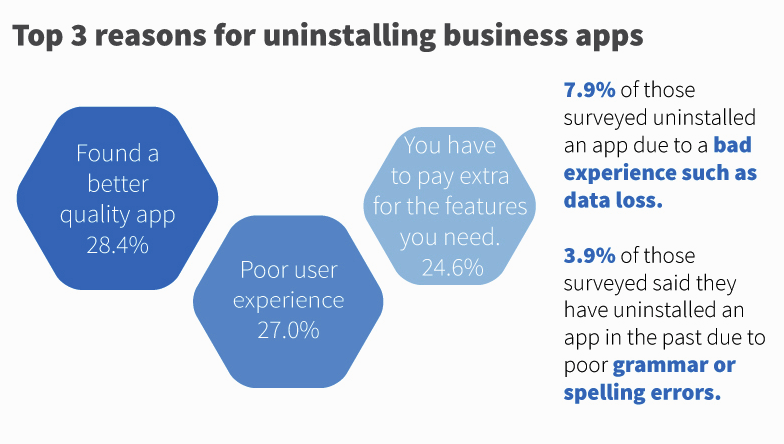
A recent survey suggested that people delete recently added apps from their phone due to ux issues 27 percent of the time, specifically as it related to the user interface.

So the challenge is how can someone build an engaging product but that is still easy to use. The answer is easier to say than to do; balance novelty with expectation. Novelty will engage your customers while meeting their expectations will help them navigate your application. Novelty is easiest to develop when it comes visual display of information. Exciting, engaging images evoke the aesthetic of sensation, or the experience of engaging with something new. This triggers the dopamine rush that encourages individual to repeat actions. In terms of a website or app, dopamine encourages continued use.
This dopamine rush can be extinguished if the customer becomes frustrated by not knowing what to do next. This is where expectation become critical. By structuring your app or website according to generally accepted norms, you can minimise the risk of customer frustration by avoiding common mistakes that poorly designed front-ends tend to make. These errors include:
- non-standard GUI (non-standard scrollbars, text and headlines; buttons that do not indicate an action);
- inconsistency (using different words or commands or using the same word for multiple concepts);
- no default values (by not using drop-down menus in your app, you can slow down user interaction);
- user “dump” (when you don’t provide easy-to-understand setup information);
- one screen size;
- small click targets; and
- feature overload.
By mixing unique displays with common structures, you can enhance the usability of your site, making it engaging and easy to use. By achieving engagement and ease of use, your product won’t just be a joy to use – for your customers it will soon become a habit to use.
Comparison Between the Two
By now you should be able to see why you need both and the difference between the two standards. Product-market fit is useful to potential customers while usability speaks to whether a customer can deploy the product and get it to do what it is supposed to do. An easy to use product that does not address the needs of the market is not something anyone will pay for, but something that everyone needs but no one can use will actively alienate your potential customers. While usability is of course important, something that addresses a very underserved need for a large audience can overcome small usability issues so it is crucial to address product-market fit first and well in your development process.
Addressing these duel concerns should figure significantly into your lean startup approach and how you develop your minimum viable products. As discussed in prior posts, the first step in the lean process is to build and deploy low-fidelity MVPs. These prototypes should initially focus on addressing questions related to product-market fit. This was already alluded to since most of the questions we suggested you ask during the low-fidelity stage regarded customer needs. Product-market fit determinations always begin by learning what the customers need first. You can’t know how to address a problem until you know what your customers need.
Once those questions are addressed, move on to developing your high fidelity MVPs and focus on usability questions. As discussed in prior posts, a high fidelity MVP is closer to the more refined product that you are planning to market on a broader scale, while a lower-fidelity MVP is not. That is why it makes sense to focus on usability at this stage. If you did the low-fidelity MVP testing correctly, you can move forward confident that the item you are making more usable is something that customers will actually want to use.
Product-market fit gives your business its purpose by satisfying a customer need, while usability builds customer loyalty to your product. Both are required for sustainable business growth.

